MINI HOMES
Logo concepts
NOV 26
Hey Josh and Ben,
Here’s my logo concepts for Mini Homes.
In these mock ups I’ve done a version in the colour palette you referenced as well as full mono and an overlay example.
I have provided 3 concepts for review and would love to know your preferred version and any tweaks you’d like to suggest.
I look forward to hearing your thoughts!
*Click on any image to see it in isolation
Mini A - Joined Up
Image: Starting point.
This concept started by building the shapes of ‘mini’ through crescents and simple block shapes to try and configure faces. It didn’t work, but what started as a simple structure came to together for a fluid contemporary icon with Scandi vibes that shaped the rest of the design process.
This is my personal favourite.
Bringing these shapes together we see motion through life, people, spaces, the hope of a sunrise or rainbow silhouette and unification.
This icon would be easy to apply across multiple functions and I feel would appeal to funders and the target audience of the homes themselves.
Mini A - full icon with ‘mini homes’ accompanying text (could be used without text)
Mini A - Section concepts



Mini B - Hill Side
This concept is simple and clean, using a wave/hill to slice under mini to make the text more dramatic and emphasise there’s nothing small about having a home, no matter the size - it’s significant.
This leaves little space to question the company name and adds gentle drama.
Mini B - Primary Icons
Mini C - Mini Homes Side Profile
This idea takes a side profile of the MH property renders and embeds the ‘M’ to create a clean and dynamic icon.
The full version expands for the full logo.
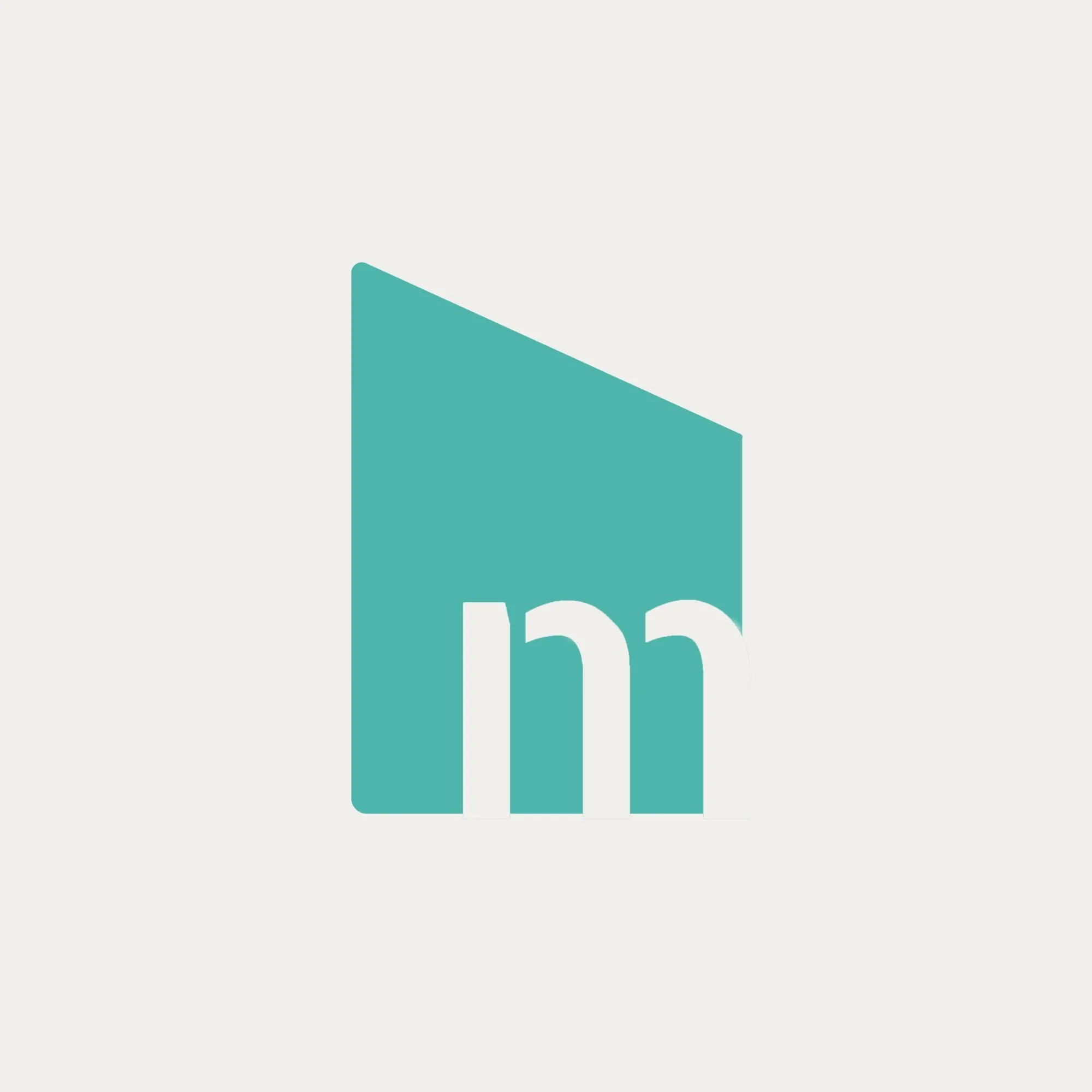
Mini C - Primary Icons